
UX/UI & Branding
Open for new projects
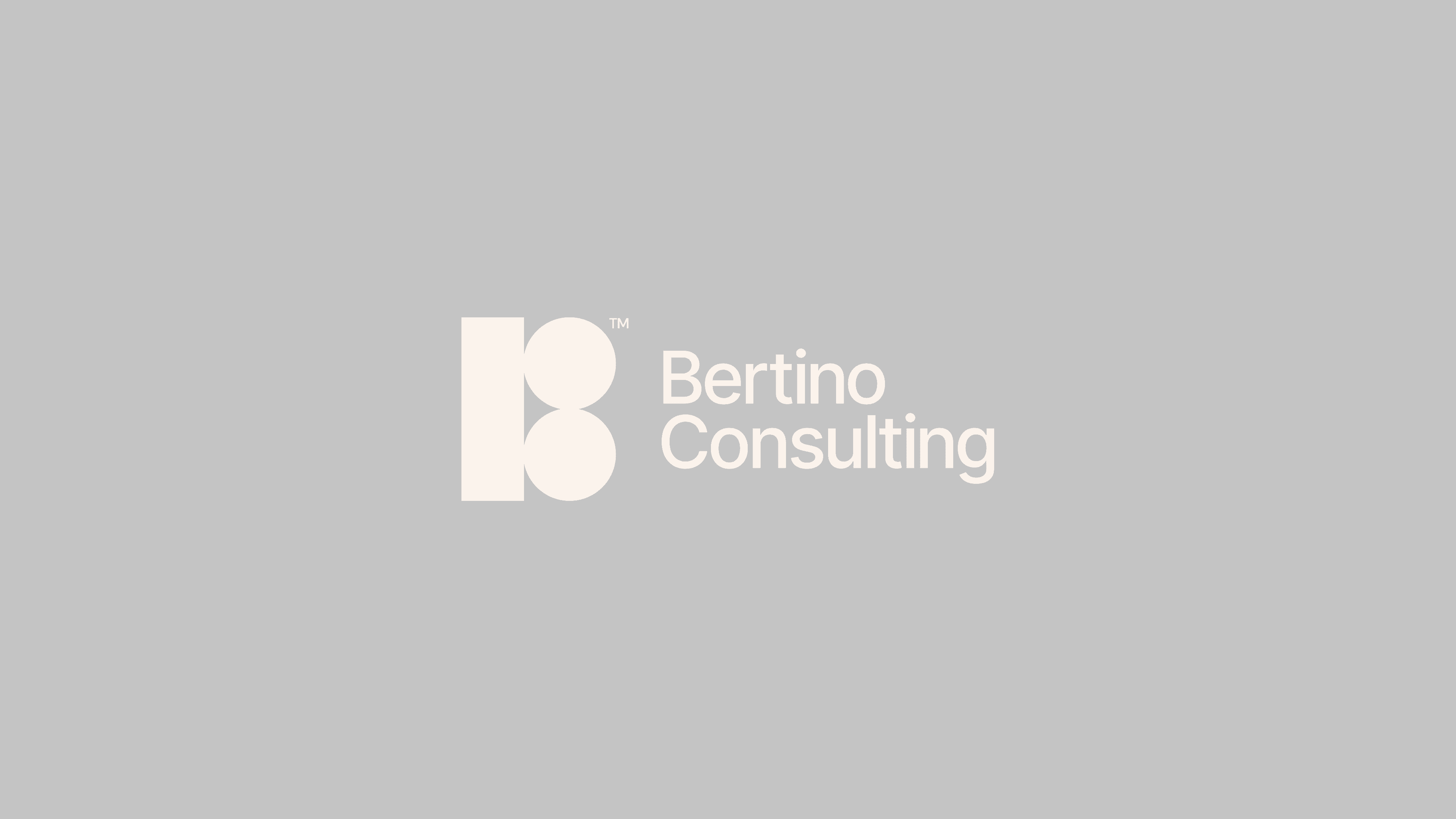
Bertino Consulting
2025
Brand identity
Bertino Consulting is a content-first design studio specializing in fintech products and services. They approached Sällsam Studio with a clear brief: to craft a new brand identity that reflects their focus on clarity, while also feeling modern, sleek, and adaptable across everything from social media to merch.
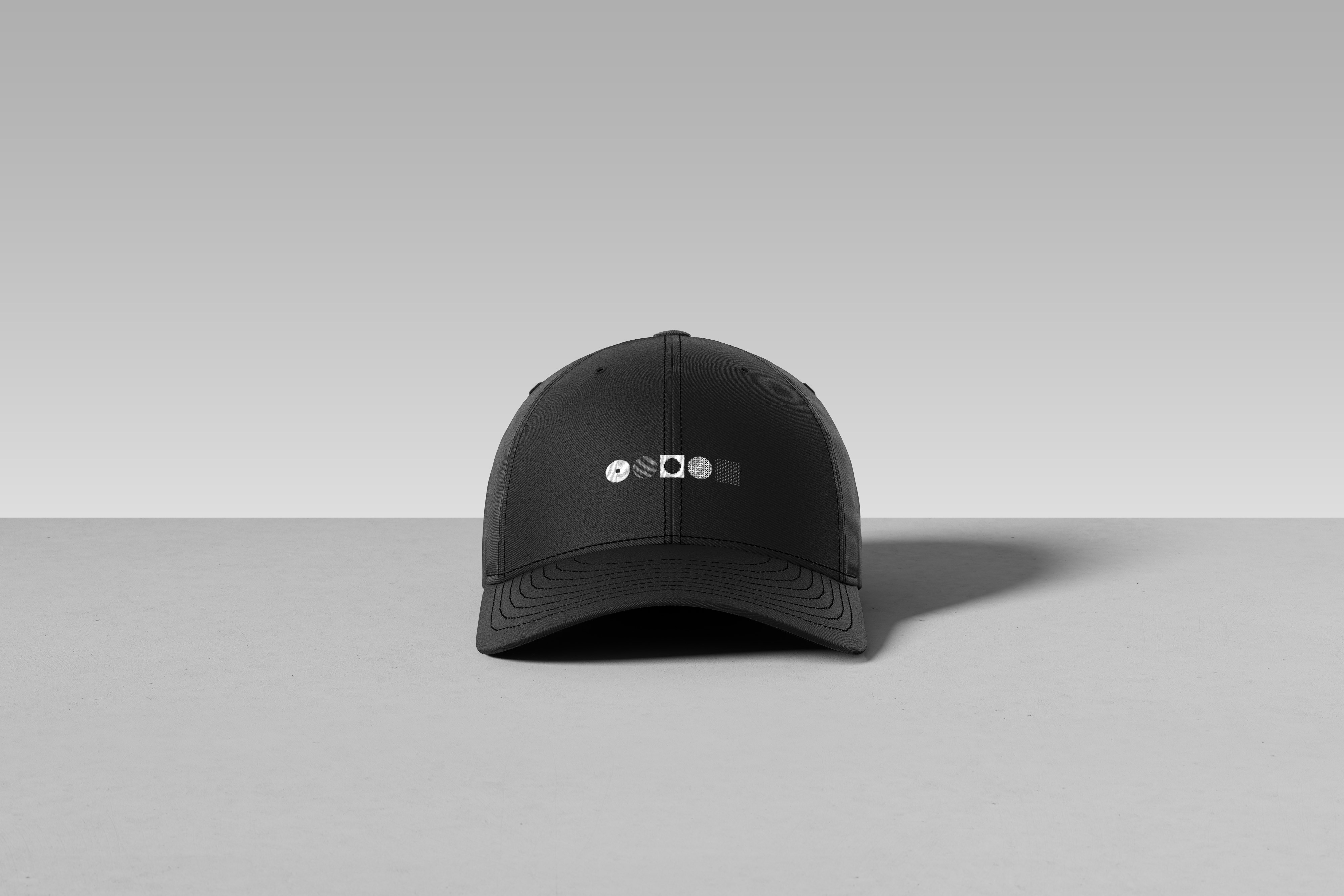
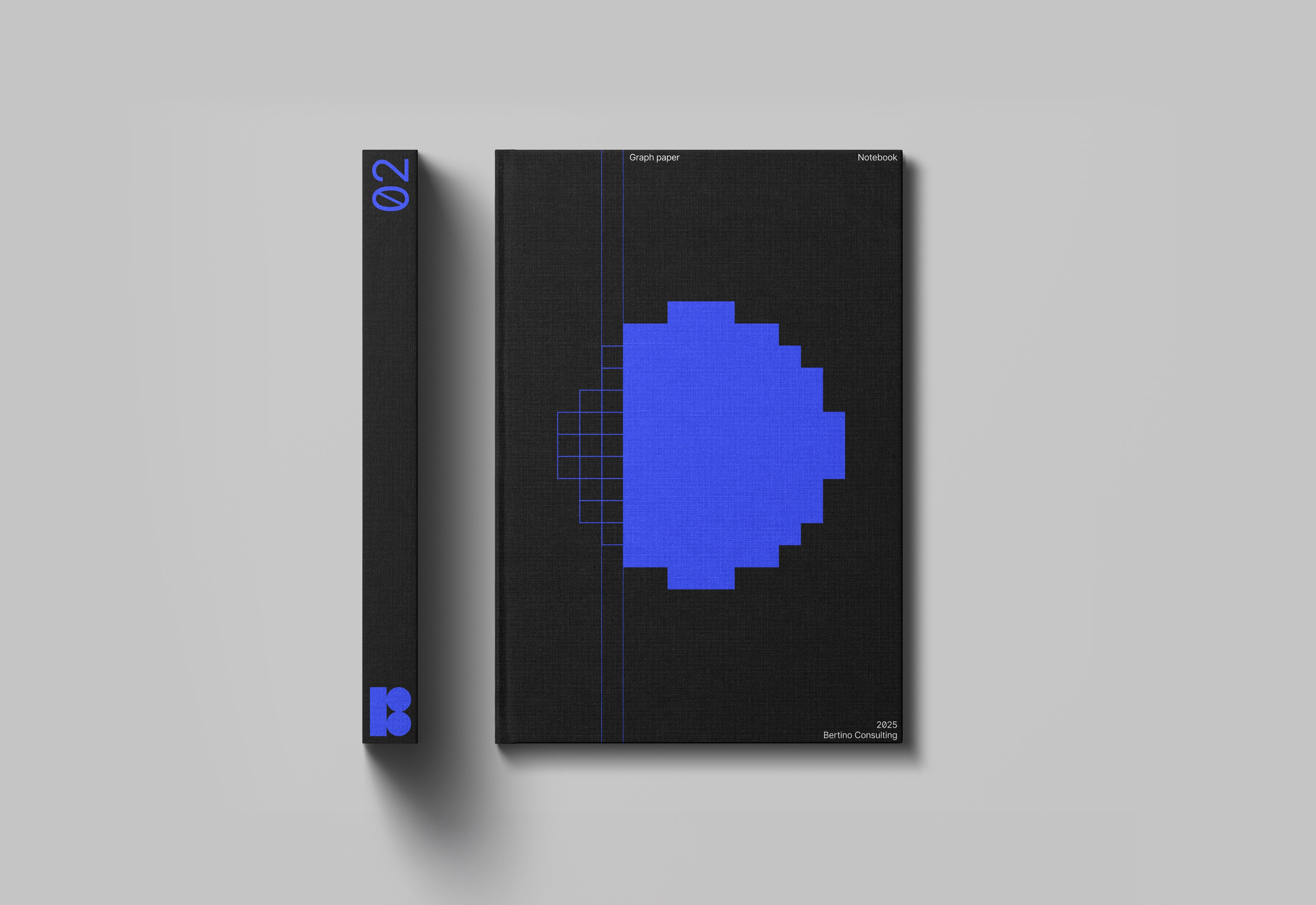
The concept is built around a visual interplay between circles and squares. Circles represent the “lighter” side of their work, things like shipping crisp UI copy – while squares stand for the more foundational efforts, such as content strategy. By constructing circles from squares, and squares from circles, the identity becomes a visual metaphor: each side reinforcing the other, coming together to create something greater than the sum of its parts.
UX/UI & Branding
UX/UI & Branding


Brand identity
Bertino Consulting
Bertino Consulting is a content-first design studio specializing in fintech products and services. They approached Sällsam Studio with a clear brief: to craft a new brand identity that reflects their focus on clarity, while also feeling modern, sleek, and adaptable across everything from social media to merch.
The concept is built around a visual interplay between circles and squares. Circles represent the “lighter” side of their work, things like shipping crisp UI copy – while squares stand for the more foundational efforts, such as content strategy. By constructing circles from squares, and squares from circles, the identity becomes a visual metaphor: each side reinforcing the other, coming together to create something greater than the sum of its parts.